
ADVENTURE
And yet, somehow that dragon ended up being a duck in the actual game. Is it just me, or does it seem like the dragon is the good guy here? Like he's happy he found the key. Dragons don't pick up keys in the game...

AIDYN CHRONICLES:
THE FIRST MAGE
If you look at the left side and title logo of this one, it's pretty cool...the people on the right, however...are not quite as successful (and who are they even supposed to be??) But one thing that's nice about it in general is that it's one of the few N64 game boxes that uses hand-drawn art instead of CG or polygon models.

ALBERT ODYSSEY 2
Chibi clay models are awesome!

ALBERT ODYSSEY:
LEGEND OF ELDEAN
I'm not the world's biggest fan of "generic" anime art, but I have a soft spot for this one, anyway. Maybe I'm influenced by my fondness for the game and characters, but it's also interesting composition. I don't know if I quite get why the women are all so huge, though.

ALUNDRA 2
This is actually much better than the Japanese version's art, which only had Flint in a striking pose on the front. The color, lighting, and art style are all fantastic, and it's good to have more elements from the game (in this case, some big boss characters) besides just the main hero on the front cover.

AXELAY
Konami had a lot of great cover art in the 8 and 16-bit eras.

BANJO-KAZOOIE
I'm not a huge fan of CG boxart overall, but this is one of the few I think was especially well-done. Very colorful, a lot going on, and uses a unique perspective like oldschool videogame boxart would have.

BATMAN:
RETURN OF THE JOKER
What better way to grab your attention in the store than a giant maniacal Joker face? I also like how he's pushing aside the title area. (It was also pointed out to me that it appears they tried to make it look like an actual comic book cover.)

BATTLETOADS
As we go on with this list, we'll see more and more how interesting use of perspective can add punch to the action and make the artwork more appealing and eye-catching, like the slanted background in this case, and the camera view from below Pimple looking up under the rock he's lifting. (Though it's strange he's the main centered toad since he wasn't playable in the game.)

BERZERK
My memory thought this was the box art for 2600 Berzerk, but when I Google Image searched, what came up was something completely different. I found out this was actually from the manual. In the game, Evil Otto is just a bouncing happy face, but I used to think he was actually pretty damn scary-looking here, especially when coupled with the fact that he's completely invincible and unstoppable in the game. This is my overall favorite piece of Atari 2600-related artwork.

BRAIN LORD
Nice landscape art. I like purple skies and floating stone towers. I never realized how many game boxes have a cloudy background with a lighting bolt coming out of the left side of the sky.

BRANDISH
The people's faces are generic anime, but the rest is beautiful. I like how the spiral effect makes the characters appear to be coming right out at you.

BRATACCAS
I had never heard of this game before, but I stumbled onto this in my searches for other game box art, and holy crap, is this beautiful!

BUBSY IN CLAWS ENCOUNTERS OF THE FURRED KIND
Bubsy may be an unloved character, but the use of perspective on this one is actually pretty neat, imo. That, and I like cartoony art.

CASTLEVANIA
I went this version of the boxart because you can see more of the full image. Thanks to Sweetbee for this one.

CASTLEVANIA 3:
DRACULA'S CURSE
This one shows quite a lot of stuff from the game going on. I've always liked the way the castle looks in the far background, with that huge stainedglass window. (Click for Larger Version)

CENTIPEDE
Not boxart, but it doesn't look like this actual art was used for any home versions of Centipede. I'm not the kind of person to get a tattoo, but if I was ever forced to get one against my will, I just hope it will be this.

CONTRA 3: THE ALIEN WARS
This is so superior to the recent Contra series game box art I've seen that it's unbelievable.

CONTRA: HARD CORPS
So is this.

CRYSTAL CASTLES
Great cartoon art with a neat angular approach to the style.

DEMONS TO DIAMONDS
Allright, I admit I want to punch out that kid in the upper right corner, but I'm okay with the rest. Is anyone else reminded of Dr. Mario for some reason?

DESTINY OF AN EMPEROR
The only problem with this one is that the daimyo's arm and hand holding the sword (reaching out at the bottom) is very awkward. But the rest is just fantastic.

DOOM
I have never been a huge fan of DOOM, but I've always liked this artwork.

DRAGON QUEST 6
My favorite of the Akira Toriyama Dragon Quest boxart.

DRAGON WARRIOR 2
This is one is just cool fantasy art. What I really like is that four-armed dragon statue that's "hidden" behind the game's title in the far background.

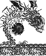
DRAKKHEN
I don't know what version of Drakkhen this boxart is from, but it's the same image from the Super NES version that I'm familiar with. Aside from the obvious eye-appealing level of detail on the dragon, there is also that neat pile of dead gargoyle bodies and that mysterious pool of blood oozing out of the grave in the ground.

EQUINOX
What's interesting about this artwork is that almost the entire middle of the scene is just sky and ocean while the details are on the edges. The landscape looks fantastic, but if you look carefully, you'll notice some monsters from the game are "hidden" in the artwork, like the Troll on the side of the tree, and one of the floating islands is the boss Tsung Tsung.

E.T. THE EXTRA-TERRESTRIAL
I'm not posting this ironically. That's actually really good artwork of E.T. and Elliot. I like the spaceship and the scary looming heads of the two pedophiles FBI Agent and Scientist.

ETRIAN ODYSSEY
The characters look like "every Atlus game character ever", but what an amazing forest backdrop! (Yes, I have a thing for forest scenes.) And the framing artwork is nice, too.

FINAL FANTASY 3
Man, oh, man, why did they have to change this to the ever-so-eye-catching "plain white box" for the American release?

GALAGA
The use of game graphics in the background is a nice touch. Nice view from below the spaceship, too.

GARGOYLE'S QUEST
Firebrand got more and more realistic-looking with each new release in this game's series, but the original cover art on the Game Boy classic is still my favorite. I just love that cartoony style, and I like the pink ghost enemy, too. I know he's supposed to be the "Red Blaze", but I still like him better when he's green. Go figure.

GARGOYLE'S QUEST 2
Though I do admit to being fond of this one, too, just not as much as the original.

GHOSTS N GOBLINS
This one's so bright and colorful it makes me happier to look at than it does for me to play the game. Nice composition.

GRADIUS
A lot of space shooters (and Konami games) have great cover art.

GRADIUS 3
Like this one.

ININDO: WAY OF THE NINJA
This one is fantastic! A lot of stuff going on. Ninjas, dragons, and Koei's oft-depicted Oda Nobunaga looking as evil as ever. As much as I like cartoon art, it's nice to see something a little more realistic for games with a more serious tone.

KID ICARUS:
OF MYTHS AND MONSTERS
Very unique perspective on the columns there. Not often do you see a view from below looking up like that. Eggplant Wizard is a bonus, too.

KING ARTHUR AND THE
KNIGHTS OF JUSTICE
I think it's possible they just took a cel from the opening sequence of the show to make this, but I haven't actually done a side-by-side comparison. It could be redrawn. I don't know, but I still think it's neat either way.

KINGSLEY'S ADVENTURE
By now you probably realize I have a thing for cartoony game art, but the use of a conical perspective on this one really gives it an added edge.

KIRBY'S ADVENTURE
Beautiful Kirby art. Much nicer than the blase modern Kirby box covers. Having him inhale the background to reveal the dark creatures underneath was a creative touch, too. The ability to eat an entire landscape, however, is quite impressive.

LAGOON
The coolest part of this is that the reflection of the castle in the water is a bunch of monsters based on several of the game's bosses (it's easier to see in person).

LEGACY OF THE WIZARD
While I wouldn't claim these people are the best-drawn things in the world, the bizarre coloring gives off a weird "frozen in time" vibe. Did you spot the little creature on the big man's shoulder?

THE LEGEND OF ZELDA
A LINK TO THE PAST
My favorite boxart in the Zelda series is the Japanese artwork for A Link to the Past, but unfortunately, I can't seem to find a decent-sized picture of it on the internet anywhere, and I don't have my own copy of it to scan. Drat! Anyway, the anime Link is pretty cool, but what I really like is the forest background with the light shining down on the Master Sword.

Here's an image from the manual with the same art minus Link.

LITTLE NINJA BROTHERS
I love this cartoony art style! The action poses for Jack and Ryu are great, the curved, slanted perspective on the background is unique and eye-catching, and there are some very recognizable elements from the game, such as the Evil Queen, Mt. Cone-Rum, some minor enemies, and the Whirlybird. I also love how the entire image is framed with a scroll.

LORDS OF MAGIC
Guy riding on a raptor is only the icing of the beautiful landscape cake of this one.

The special edition's cover ain't too shabby, either, although they did reuse the eyes in the sky and the ground below the wizard.

MACE: THE DARK AGE
I have a confession to make: I wanted to play this game when it first came out, and that desire was based almost entirely on how cool the box art is.

MAGI NATION
If only the actual mushroom city in the game had looked as fabulous as that.

THE MAGIC OF SCHEHERAZADE
This boxart is only very tenously related to the game (there aren't any pterodactyls or horses, for starters), but I was always intrigued by it from the moment I first saw it. Very "Ali Baba and the 40 Thieves"-ish.

MANIAC MANSION
Great cartoony art that really fits the theme and humor of the game, giant villain head over the background, creepy mansion on the hill, falling meteor, - this boxart is just perfect in every way.

MAPPY
The MSX version of Mappy. Was it intentional for it to look like Nyamco is kicking Mappy in the butt?

METAL STORM
I always loved the design of that robot ever since I first saw it in Nintendo Power magazine. It's like a combination of Transformers and Robotech. The planet backdrop
(which looks like a civilized Jupiter) is pretty neat, too.

MIGHT AND MAGIC
The color and lighting effects on this are some of the best I've ever seen... even if it the characters do look like "cowards in tights".

The PC version of Might & Magic used part of the game's map for its cover art. That map is one of my favorite all-time game maps due to the level of detail and the interesting little extra touches, such as the drawings of creatures roaming about the world.

MIGHT AND MAGIC 6:
THE MANDATE OF HEAVEN
More cool fantasy art.

MIGHT AND MAGIC 7:
FOR BLOOD AND HONOR
The Might & Magic series has some truly wonderful box art.

MOON PATROL
More great oldschool art. I almost wonder if more time went into Atari 2600 game boxart than the games themselves.
| 


